A Global Warming Graph
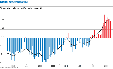
Sometime I've got to get round to understanding global warming. This is a good graph of the time trend. What we need is not just a theory to explain the recent warming (which has now leveled off, it seems) but the cooling periods, e.g. 1880-1910. Otherwise, whatever causes the earlier cooling-- and it was not carbon dioxide-- might be causing the recent warming.
Labels: global warming
To view the post on a separate page, click:
at
12/06/2008 10:26:00 AM (the permalink).
![]()
![]()


<< Home